MENU

Showing posts with label Watercolour. Show all posts

Thursday, 17 June 2021

Who Wore It Better: Card Edition

Watercolouring has always been my favourite background technique.  I love how soft the colours become and using my Stampin' Up! ink pads as pallets makes it super easy to do.  But now that I have discovered the alcohol ink technique I'm torn!!  I love how you can get so many different looks depending on how you apply the alcohol, and it dries so fast you can complete a project in no time at all.

So I need your help to decide--who wore it better?  :)  Please vote in the comments, or on my Instagram or Facebook pages, and I'll declare the winner at the end of the week.  And if you don't already follow me there, please do!  I'd love to help inspire your creativity.  

Alcohol Ink Background

Wednesday, 15 July 2020

Watercolour Technique (Blog Hop)

It's Christmas in July everywhere you look these days, so I was inspired to add a twist to our blog theme this month!  Our focus this month is on techniques and I had to use my very favourite technique--watercolouring--on this Christmas card.


I repurposed my Good Morning Magnolia stamp into a poinsettia!  

I heat embossed the flower image in gold and then used several ink colours to add depth and dimension.  This really is the EASIEST way to watercolour.  The heat embossing keeps the water and ink contained so you never colour outside the lines!


I layered the coloured and die cut image on a Forever Gold Laser Cut frame (with a rectangle of white cardstock behind to help it pop), and put it all on a card base of Shaded Spruce.  


Some added gems helped anchor my sentiment as well as provide the sparkle every Christmas card needs.


I kept the inside of my card simple with some more gold embossing.


For some added fun I decided to watercolour a matching envelope!  I used my (retired) Envelope Punch Board to create the envelope out of watercolour paper, and repeated the gold embossing and colouring on the front and back.


I think this will make a wonderful holiday surprise for someone when it really is Christmas. ;)

Please continue hopping along to see all the other wonderful techniques showcased this month:


Saturday, 15 February 2020

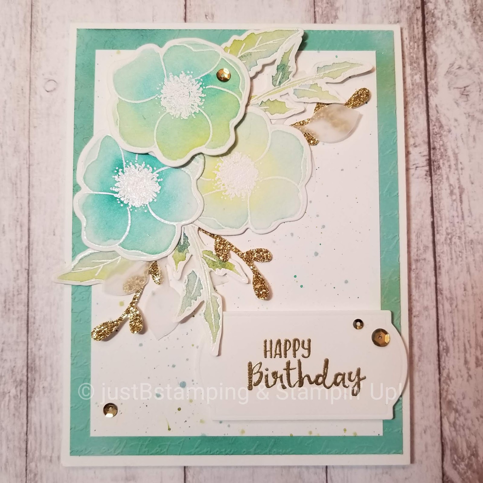
Stamping Symphony Blog Hop--Painted Poppies

Time for another Blog Hop with the ladies from Stamping Symphony!

We are still showcasing all the lovely new products in the mini and Saleabration catalogues--there is so much great stuff to while-away these wintry days!  I'm featuring the Painted Poppies suite this time around.


I thought the Painted Poppies DSP was the most eye-catching part of the whole suite and actually considered purchasing just the paper--I'm so glad I didn't!  I knew that I would be seeing tons of inspiring projects once the catalogue went live and would want more, and I was right.  ;)  I did limit myself to one of the two (yes, two!) coordinating bundles as a compromise to my wallet and those stamps and dies have revived my love of watercolouring.


I was inspired by this card from the very talented Tammy White at https://stampspaperscissors.com/--so much texture, and so much to see!  I improvised my version based on the supplies that I had and squaring up those layers (I love the look of off-centred layers but my OCD-heart just can't do it!).  I rearranged the layout as well, just to mix it up.

Peaceful Poppies Elements - Forever Blossoms by Tammy C. Wilson

For my embossed background I started with a layer of Coastal Cabana cardstock and sponged various splotches of Pretty Peacock and Bermuda Bay ink randomly on the paper.  I then ran it through my Big Shot with the Scripty 3D Embossing Folder.  It's hard to catch on camera but you can see a few spots peeking out.


On the next layer I splattered ink from my aqua painter in Old Olive, Bermuda Bay and Pretty Peacock onto white cardstock.  One of my goals for 2020 is to get better at splatter, so you should be seeing lots of that from me in the coming months!


I love, love, love white-on-white embossing these days....it may need to be a Techniques class soon!  I embossed the flowers and leaves in white on watercolour paper and started playing.  I watercoloured two poppies in Coastal Cabana and Bermuda Bay, with Daffodil Delight mixed in places, and one poppy with Bermuda Bay and Pretty Peacock inks.  I also watercoloured various leaves from the set with Old Olive and Pretty Peacock.  Everything was dried and then fussy cut or cut with the coordinating die sets.


I added the same hints of gold glimmer paper and vellum as in Tammy's card, and a few sequins left over from a Paper Pumpkin kit.


I heat embossed my sentiment in gold on one of the labels that comes in the bundle and popped it and one flower up on dimensionals.  I tried to keep in mind the thickness, as all that layering on its own added some depth to the focus point, and I still want to be able to mail the card.


I love to be inspired by the works of other crafters--whether casing an exact card or challenging myself to mix it up and make it my own.


Do you have a favourite crafter I should check out?  Shout out in the comments if you do!

And here are the links to the other bloggers this month:


JustBStamping (Barb--you're here!)

Stay warm,
Barb


Saturday, 15 December 2018

Wintery Penguin Love (Blog Hop)

In just a few weeks the holidays, with all their sparkle and colour and activities, will be over, and the reality of a cold long winter ahead will sink in.  As much as I love Christmas, I love when my house returns to a more minimalist and serene look after the decorations come down!  And I have always found winter to be a nice time of year....curled up reading one of the many books my hubby bought me for Christmas (hint, hint!) and waiting for those first blooms of Spring.  But each year winter seems to get just a little bit longer, and a little bit colder, and I miss the sun a little bit more.  So for our team blog hop this month, I decided to make a card to help combat those winter blues!


I created a soft watercolour background with four colours that can be pretty intense normally--Costal Cabana, Call Me Clover, Blueberry Bushel and Highland Heather.  The watercolour wash really tones down the colours and make for an icy pastel palette. 


After watercolouring I spritzed some water droplets on top to give it some more dimension.  I think those colours really look wintery and almost like the northern lights!

I stamped my penguins in black Memento ink and punched them out with the coordinating punch, just trimming the bottom flat.  I added a coloured heart in each colour, and popped my penguins up on dimensionals.


The sentiment "With Warmth and Caring From Me" is from the Flourishing Phrases set, and suited my needs perfectly.  I left the inside of my card free of sentiment, so that this card be used for any purpose that comes up (get well, thinking of you, etc.).


I mounted my stamped piece on some shimmery cardstock to represent the sparkle of snow in the sunshine, and placed the whole thing on a Highland Heather card base.

I think this card would be a real pick-me-up to receive on a cold and gloomy February day.  This set and the punch are retiring on January 2, so get yours before they are gone!  

Hop along to see the winter or new year creations my teammates made this month:


JustBStamping (Barb--you're here!)


Product List

Sunday, 16 September 2018

Making Christmas Bright


My first must-have of the new Holiday Catalogue was the Making Christmas Bright stamp set and coordinating punch.  I posted this card on my Instagram account shortly after receiving the bundle, but wanted to share it with you here as well.  It combines several of my favourite things:  a watercolour background, a rainbow of colour, glitter, and stitching!

Here is the close up from Instagram:


And here is a shot showing some of the inks and tools I used to create it:


Wondering how I got those faux stitches on the outside of my main panel?  They are new dies in the Stitched Labels set--and they have a cross-stitch one too!!!

This was a super fast card to make, but one that I think packs a lot of punch (no pun intended!).  

Join my class on October 13 to make a card of your very own, and check out my newly redesigned craft studio.

I used bright colours for my card, would you like to see it in shades of blues for a more modern touch?  Comment below!

Barb


Product List

Sunday, 6 May 2018

Animal Outing No Line Watercolouring

No line watercolouring is quickly becoming one of my favourite techniques--I love the soft look you get.  The new Animal Outing set from Stampin' Up! was just begging for this treatment, and I absolutely adore how my cards turned out!

Animal Outing No Line Watercolouring
Aren't those little critters just precious?!  I actually hadn't intended to make a set of these, but I loved the rhino and his little birdie friend so much, I had to give the kangaroo and koala bear some ink as well. :)

I started out just playing with the rhino, stamped in Smoky Slate on watercolour paper for fun.  I very carefully played with the ink with my aqua painter, trying not to "erase" the definition lines.  I added a little bit of Basic Grey ink for shading, and some Flirty Flamingo blush to his cheek and the birdie.

I then added just the softest touch around him, with some Pool Party shading around the top, and some Mint Macaron across his feet to ground him.


Isn't he too cute??

I was working on a scrap of watercolour paper, so I reached for my stitched circle framelits and was very pleased that one of the larger circles fit!  Kismet.


I used the very delicate Quilt Top Embossing Folder to give some baby-sweet texture to the white square I mounted on top of a 4" x 8" Mint Macaron card base.  Soooo happy this colour has been brought back!

I added some matching Mint twine and tied a tiny bow.  I mounted my rhino circle on top with dimensionals, and stamped my sentiment in black on tiny strips of Whisper White, and then layered them on top with dimensionals too.


On the inside I embossed just the edge of a square of whisper white with the same quilt folder, and added "celebrate" from the Happy Birthday Gorgeous set.

Then I tackled the kangaroo!  I followed all of the same steps, stamping and colouring with Crumb Cake ink, and adding some Smoky Slate for the koala bear.


The twine comes in a combo pack, so I used the matching crumb cake version here, and mounted everything on a pool party base.  Here is a closer look of the focal point.


I could not be happier with how these cards turned out.

Next time I'm going to make some "kid" cards, with the brights collection of colour.  I'm sure they are going to be just as much fun in vibrant colours!


Please leave a comment if you can, I'd love to hear from you!

Barb

Product List